 Credit

Color has power. It sets mood, builds style, and helps your work stand out. When you color grade images well, you guide viewers to what matters and you give your photos a look that people remember. This guide shows you how to do it with confidence. You will learn the difference between fixing color and styling color, core tools that work in any editor, repeatable workflows for common photo types, and time‑saving AI options for fast and consistent results. We will also cite reliable sources and share checklists you can use today.
Color grade images vs. color correct images
Color correction and color grading are not the same, and this matters. You fix the file first, then you style it. Most pro workflows follow this order.
- Color correction brings the photo back to neutral. You set exposure, white balance, and contrast so the scene looks real. This lays a clean base.
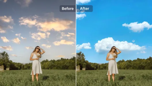
- Color grading shapes mood and style. You shift hue, add tone, and guide the eye. You create a coherent look across shots.
This split is also how major tools explain it. Adobe notes that correction makes images look “as they appear in real life,” while grading “conveys a visual tone” by adjusting curves, white balance, color match, and contrast. See Adobe’s overview for more detail: Adobe on color grading. SmugMug draws the same line and lists the controls that sit under each step, which is a helpful checklist to keep next to your screen. You can read it here: SmugMug’s guide to color grading.
When you color grade images, think like a director. The goal is not to make the file “correct.” The goal is to make the story clear and the feeling strong.
Core tools you will use in every editor
Most editors name tools the same way. You can open Lightroom, Photoshop, Capture One, or others and find these controls. The labels may move, but the work stays the same.
- Exposure, white balance, and contrast: Use these first to build a clean base.
- Tone curve: Add an S‑curve to increase depth. Use the RGB channels to push color into shadows or highlights.
- HSL/Color Mixer: Target one color and change its hue, saturation, or luminance. This is great for skies, foliage, fabrics, and skin.
- Color grading wheels (shadows, midtones, highlights): Add different tints to each range. This replaces old “split toning.”
- Local adjustments: Masks, brushes, and gradients help you grade only parts of the frame.
- LUTs and presets: These save looks. LUTs remap color; presets store slider states. Use them as a starting point, not as the final step.
Keep the base edit clean. Then add style one move at a time. Small moves add up.
A step‑by‑step workflow to color grade images
Use this simple order and you will avoid most problems. It works for color grading photos in any editor.
1) Set the base
- Fix exposure. Check the histogram. Protect highlights first.
- Set white balance. Pick a neutral point or adjust by feel. Do not chase perfect numbers. Aim for a believable base.
- Balance contrast. Start with the basic contrast slider. Then move to the tone curve.
2) Shape luminance with the curve
- Add a gentle S‑curve. Lift the highlights a bit. Pull the shadows a bit. Keep midtones natural.
- If the image looks harsh, flatten it slightly. If it looks flat, deepen the curve.
3) Guide color with HSL
- Shift hue to bring colors to where you want them. For example, move green toward teal to get a modern look.
- Raise saturation on one color and lower it on others to add separation.
- Adjust luminance to brighten skin or darken a sky without clips.
4) Add tone with color grading wheels
- Shadows: Cool blues give depth. Warm browns add vintage mood.
- Midtones: Warm midtones help skin. Cool midtones fit moody scenes.
- Highlights: Warm highlights feel soft. Cool highlights feel crisp.
Keep moves small. Most great grades come from tiny, stacked changes.
5) Use local masks
- Add a radial mask to lift faces slightly.
- Add a linear gradient to cool a sky.
- Brush warmth back into hands if needed.
Masks are where your photos come alive.
6) Final balance
- Compare to the start. Toggle before/after often.
- Check the histogram. Avoid clipping unless it is a choice.
- Step away for a minute. Come back and make one or two final moves.
How to color grade images for different genres
Different subjects ask for different moves. Here are simple recipes you can adapt.
Portraits: skin first, then style
- Base: Keep midtones safe. Protect skin detail.
- Skin tones: In HSL, adjust orange hue slightly toward red if skin looks green, or toward yellow if skin looks magenta. Keep saturation steady.
- Background: Reduce saturation in greens and blues around the subject. This makes skin pop without over‑saturating.
- Grading: Warm the midtones slightly. Cool the shadows a bit for depth.
- Masking: Lift exposure on the face by 0.1–0.3 EV. Add a touch of clarity only if needed.
Avoid blue in skin shadows. It looks “dead.” If skin goes waxy, back off global noise reduction and global clarity and use local tools instead.
Landscapes: separation and depth
- Base: Expose to protect highlights. Pull back whites if you shot at sunrise or sunset.
- Sky: With HSL, shift blue hue a bit toward aqua for a clean look. Reduce blue luminance if the sky looks washed out. Do not crush it.
- Greens: Shift green hue slightly toward yellow for spring. Toward teal for a cinematic feel. Reduce saturation if greens distract.
- Grading: Cool shadows for mood. Warm highlights during golden hour.
- Masks: Gradient on the sky to cool and darken. Brush warm light on sun‑lit areas to guide the eye.
Watch banding in blue skies when you push hue and luminance. If you see banding, reduce global saturation a little and use noise reduction.
Product and e‑commerce: accuracy first
- Base: Use a gray card or a color checker when you shoot. Match white balance to that reference.
- HSL: Change saturation gently. Keep brand colors exact. If you must match, use a reference sample.
- Grading: Keep it subtle. A slight cool shadow tint can add polish. Avoid warming midtones that can shift product color.
- Proof: Soft proof to sRGB. Check on a calibrated monitor. View on a phone.
If color must match a brand Pantone, shoot a color chart and use a color managed workflow. Style comes after accuracy here.
Wedding and lifestyle: unity across a set
- Base: Sync white balance across scenes. Group by lighting type.
- Grading: Choose one style and carry it through. Warm midtones often flatter skin and candles. Cool shadows can add depth.
- HSL: Lower saturation in greens if they distract in outdoor scenes. Keep reds in check to avoid red noses.
- Batching: Build a preset from your best image. Sync to the rest. Tweak per image.
When light changes fast, prioritize white balance and exposure first. Then apply your look.
Advanced moves for stronger color grading photos
Use these when you want more control or need to solve tricky problems.
- Channel curves: Push a touch of cyan into shadows (lower the red curve in shadows). Add a hint of yellow into highlights (lower the blue curve in highlights). This creates a classic film‑like balance.
- Point color (selective color): Use it to target a narrow band (like one shade of red in a dress) and move only that band. This keeps skin safe while you style the dress.
- Camera profiles: Start with a good profile (e.g., Adobe Portrait, Camera Standard). The right profile gives you better starting color and cleaner skin.
- Soft proofing: If you will print, soft proof early. Add a little contrast and saturation if the print profile looks flat. Avoid heavy shadow tints that can block up in print.
- Dehaze and clarity: Use with care. Dehaze adds contrast mainly in low‑frequency areas. It can shift color, so check HSL after you use it. Clarity can break skin. Use local clarity, not global, in portraits.
Keep your grading consistent: calibration and color space
You cannot color grade images well if you do not trust your screen. Use this simple setup.
- Calibrate your monitor to D65 (6500K) and 100–120 cd/m². Recalibrate every month if you edit often.
- Work in a neutral room if you can. Avoid bright colored walls. They cast color into your eyes and change how you see.
- Use a color‑managed app. Soft proof to sRGB for web. Export in sRGB unless you know your client needs Adobe RGB or Display P3.
- If you edit on a laptop, reduce brightness. Very bright screens make you push images too dark.
Good viewing conditions are part of EEAT‑level craft. You need them to give accurate work.
AI that speeds up color grading photos (and how to stay in control)
AI can save hours when you color grade images at scale. It should not replace your eye, but it can get you close in one click. Here are practical, low‑risk ways to use it.
- Quick global starts: Use AI to set a balanced base or to apply a safe look. Then refine with curves and HSL.
- Local masks: AI subject and sky detection gives you clean masks in seconds. You can then add targeted warmth or coolness.
- Reference matching: AI can match color and lighting from a reference shot to a target shot. This is useful for campaigns and albums.
- Batch work: Apply one AI‑assisted look across a set for strong consistency, then spot fix.
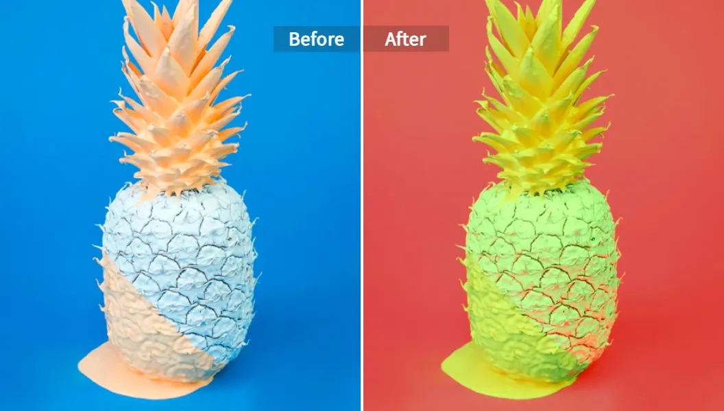
Pixelfox AI keeps you in control while removing manual grunt work. For example, the AI Image Colour Changer lets you shift specific colors or the whole palette while it keeps harmony across the frame. You can do precise changes without fighting masks.
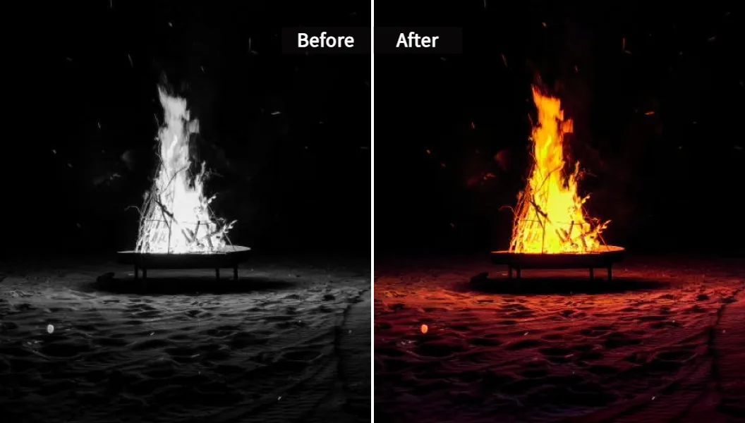
If you work with scanned family photos or archives, our Photo Colorizer adds realistic color to black‑and‑white images in seconds, which is ideal before you do a modern grade. For one‑click style matching, the Color and Lighting AI Transfer can bring the look of a reference photo to your current image, which helps when you must keep a brand tone across a set.
Use AI to move faster. Use your eye to finish the job.
A practical, repeatable edit you can use today
Here is a clean recipe you can try on your next set. It works on portraits and lifestyle scenes, and it also works when you color grading photos from events.
- Exposure: Set a neutral base. Avoid clipping highlights. If needed, reduce “Whites” slightly and lift “Shadows” a touch.
- White balance: Warm the image until skin looks healthy, not orange. If you are unsure, use the WB picker on a neutral area, then adjust by feel.
- Tone curve: Add a soft S‑curve. Lift the black point a hair if you want a gentle, film‑like toe.
- Color mixer (HSL): Slightly reduce green saturation and move green hue a bit toward yellow. Boost orange luminance by +3 to +6 to brighten skin.
- Grading wheels: Warm midtones a small amount. Cool shadows a small amount. Keep highlights neutral or slightly warm.
- Local masks: Add a small radial lift on the face (0.15 EV). Cool the background with a light negative temperature mask.
- Final balance: Reduce global saturation if the image got too hot. Add a touch of vignette if it helps the subject.
This stack is light and safe. It gives shape and mood while keeping skin clean.
Quality control checklist before you export
Pro color work is not only about sliders. It is also about checks. Run through this quick list every time.
- Zoom to 100%. Look for color blotches or halo edges from local moves.
- Check skin. It should not look gray, green, or plastic. If it does, reduce global saturation, then bring back color with local masks in the right areas.
- Watch the histogram. Are you clipping shadows or highlights unknowingly? Pull back if the clip distracts from the story.
- Compare three images side by side. Do they share the same mood? If not, sync a preset and fine tune each one.
- Test on two devices. A phone and a laptop is a good combo. If the look falls apart on the phone, reduce saturation and heavy split tones.
- Soft proof if you will print. Add a touch of contrast if the print looks flat in proof.
Small checks protect your brand.
Common color grading mistakes and how to fix them
Everyone runs into these. The fixes are simple.
- Oversaturation: If colors scream, lower global saturation by 5–10 points, then bring back color in the subject with local masks or HSL.
- Muddy shadows: Too much dehaze or too much split tone in shadows can turn them brown. Reduce dehaze. Reset shadow grading and add a tiny blue or teal back in.
- Plastic skin: Heavy noise reduction, clarity, or frequency separation can remove real texture. Dial back global NR. Use local texture at low values.
- Weird color cast: An incorrect white balance can hide under heavy grading. Reset WB and set a neutral point. Then rebuild the grade in smaller moves.
- One‑click LUT look: LUTs are fine starts, but they are not the finish. Reduce LUT opacity (in Photoshop) or mix the preset with your base (in Lightroom). Then fix skin with HSL.
When you color grade images for clients, keep a light touch. People live with your edits on their walls. They should still like them next year.
Building a system for consistency and speed
If you publish often or deliver albums, you need a system.
- Create base presets: One clean correction preset per camera body and lighting type. One grade preset per look (e.g., warm indoor, moody outdoor).
- Name them well: Use clear names like “2025‑Base‑Sony‑Daylight” and “2025‑Grade‑WarmPortrait.”
- Store reference images: Keep a folder of your favorite finished edits. Use them to match tone. They are your style book.
- Use AI where it helps: Let AI set masks and match looks on big sets. Then spot fix the five images that matter most.
- Keep a color notebook: Note what worked for each shoot. Write the white balance you used, the HSL tweaks that saved a tricky scene, and what you would change next time.
This is how you move from one‑off wins to repeatable quality.
Frequently asked pro questions (short answers)
- Should I shoot RAW? Yes. RAW gives you more room to push color and tone without banding or clipping.
- Which color space should I export for web? sRGB. It is the most widely supported and it avoids washed‑out colors on some browsers.
- Do I need a hardware calibrator? If color accuracy matters, yes. A calibrated screen is the base for all color decisions.
- Do LUTs replace grading? No. LUTs are great starts. You still need to balance exposure, WB, and HSL and you still need local control.
- Can I grade on a laptop? Yes, but manage brightness and glare. Lower screen brightness and avoid bright light on your screen.
These simple answers save headaches.
References you can trust
If you want to go deeper, learn from reputable sources. Adobe has a clear overview of how grading differs from correction and which tools to use: Adobe on color grading. SmugMug also offers a plain‑language guide that lists the steps and terms you will see in pro tools: SmugMug’s guide to color grading.
These match what we covered here and they align with how working photographers deliver color day after day.
Final thoughts and next steps
When you color grade images well, you carry your style from shot to shot and from job to job. You first fix exposure and white balance. You then shape tone and hue with a few clean tools. You use masks to guide the eye. You keep checks simple and you export in the right space. This steady method gives you reliable results and a brand that people can feel.
If you want speed without losing control, try Pixelfox AI. Start with the AI Image Colour Changer to shift palettes without messy masks. Then, when you need to match a look across a set, use Color and Lighting AI Transfer. And if you bring life back to old family photos before you grade, test our Photo Colorizer. These tools help you color grading photos faster while you keep your style intact.
Color grading is a craft. With the steps above, you have a clear path. Now pick one image, apply a simple grade, and share the result. Then do the next image. And the next. Your look will grow with each pass.