 Credit

Ever dropped a photo into a “one-click B&W” and it came out flat, muddy, or harsh like cheap newsprint? You’re not alone. A great black and white picture editor does more than desaturate. It sculpts light, protects skin texture, and pulls detail from the midtones so your image looks intentional, not accidental. In this guide, I’ll show you how to pick the right editor, how to build a pro B&W workflow, and how to fix the sneaky mistakes that ruin most monochrome shots. We’ll use Pixelfox AI as our go-to (because it’s fast, web-based, and does selective edits without drama), and we’ll compare it to Photoshop and the popular online tools you’ve probably tried. If you came here searching for a black and white picture editor that actually works, you’ll walk out with a process that sticks.
What makes a great black and white picture editor?
You don’t want a filter; you want control. Good monochrome comes from how you shape luminance, contrast, and texture. That means the best image editor for black and white should let you:
- Control luminance by color. This is the “channel mixer” idea: brighten reds to lift skin, darken blues to deepen skies.
- Separate tones cleanly. You want rich blacks that aren’t crushed and clean highlights that aren’t blown.
- Add micro-contrast without halos. Texture should feel crisp and natural, not crunchy.
- Work locally. The face needs different treatment than the background. Eyes need a touch of clarity. Foreheads don’t.
- Export cleanly. Web, print, social — you want consistent results without ugly banding.
According to Nielsen Norman Group, clarity and realism in imagery drive trust and reduce friction. In plain English, if your B&W looks “off,” users feel it and bounce. Forrester has long tied better imagery to higher conversion in e‑commerce and UX studies. And yes, Statista keeps placing photo/video apps among the most downloaded categories year after year. People care about pictures. Your black and white needs to earn its spot.
The fast path: apply a smart black and white photo filter
Sometimes you just want “done.” You can still get 90% of the way to pro if you apply a good black and white photo filter and tweak a few sliders.
Here’s my quick method using Pixelfox AI’s web editor:
- Upload your image to the Pixelfox AI Image Editor (web-based, no install).
Hint: you can guide edits with plain language like “convert to black and white with high contrast and soft skin.” - Apply a black and white conversion with AI prompts.
Example: “make a film-like black and white, lift shadows a bit, keep skin smooth, add subtle grain.” - Nudge contrast and highlights.
Keep whites clean. Pull highlights down a touch if they look hot. - Add grain lightly for a film look.
Grain should be texture, not sand. - Export sRGB at web size if you’re posting online.
Common alternatives and where they shine:
- Canva: simple greyscale filter; quick and friendly.
- LunaPic: loads of effects; more “play” than precision.
- Picsart / BeFunky / Fotor: easy filters, lots of extras, decent for social.
- Carbon (mobile): specialized B&W filters and textures on iOS; nice tones for phone shooters.
These are fine for speed. But if you care about fine control and repeatable results, you’ll want a stronger workflow.
A pro workflow in an image editor (black and white with real depth)
You can build a studio-grade look even if you don’t own Photoshop. Use an image editor black and white workflow that mimics a channel mixer and local dodge/burn.
Try this in Pixelfox AI’s editor with text prompts and quick sliders:
- Convert to black and white, but keep control by color.
Prompt: “black and white conversion; lighten reds by ~10% to lift skin; darken blues by ~10% to deepen sky.” - Shape global contrast.
Add a clean S-curve. Lift shadows just a hair to keep detail in dark suits and hair. - Target the face.
Prompt: “soften skin slightly; keep pores; add clarity to eyes only.”
This is where local edits pay off. - Separate subject from background.
Prompt: “add subtle background dehaze and -10 clarity to push the background back.” - Add grain if needed.
“Fine grain, small size, low intensity.” Do not blanket the face with heavy grain. - Final check.
Zoom in. Look at hairlines, fabric threads, and edges. No halos. No crushed blacks.
If you prefer manual control in desktop tools:
- Lightroom + Color Mixer: Convert to B&W, then use the B&W mix to adjust luminance per color.
- Nik Silver Efex: Classic control over film emulations and structure.
- Photoshop Channel Mixer: More work, but full command.
Pixelfox AI gives you the same intent without manual layering. You say what you want; it sets the edits and blends them into a natural look.
Tip
If skin looks muddy, lift the “red” luminance equivalent and pull overall contrast down a touch. Then add midtone contrast back with clarity on the face only. That combo often fixes 80% of bad B&W portraits.
Advanced techniques to make your monochrome pop
Seasoned shooters, this is your playground. These moves give your black and white that gallery feel.
-
Midtone priority contrast
Push contrast in the midtones, not the extremes. Keep blacks rich but open. Keep highlights bright but not spiky. You’ll get depth without harshness. -
Local dodge and burn
Paint light. Brighten cheekbones, eye whites, and the bridge of the nose by tiny amounts. Darken jawlines and hair shadows. Small strokes. Big payoff. -
Texture split
Add a bit of clarity and structure to hair, eyes, and fabric. Reduce clarity on cheeks and forehead. It’s the classic “sharp here, soft there” portrait polish. -
Film grain the smart way
Add grain after sharpening. Keep grain size small for high-res images. Increase intensity slightly for sky or walls to hide banding. -
Split toning (yes, in B&W)
A faint warm tone in highlights with a cool tone in shadows gives depth. Think print darkroom vibes, not Instagram sepia. -
Background pushback
Reduce background micro-contrast and clarity by 5–10%. Your subject steps forward without obvious vignettes.
According to NN/g, clarity and focus reduce cognitive load. When you direct attention with local edits, your image feels easier to process and more “professional.” That’s not just taste; it’s UX science applied to photography.
Color splash the right way (keep one color in a black and white)
You want that “Schindler’s List red coat” effect? Do it cleanly.
-
With Pixelfox AI
1) Convert to B&W.
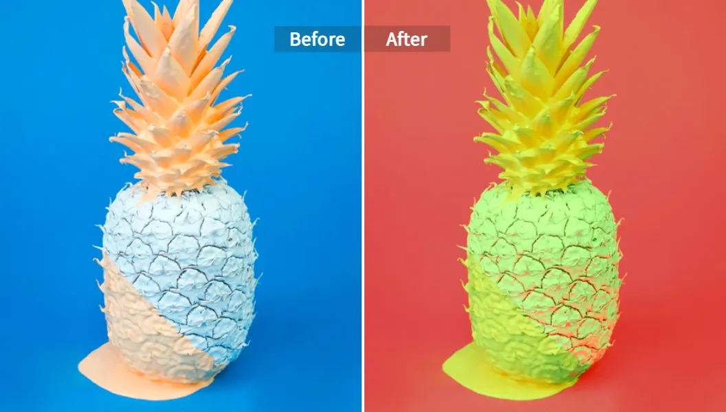
2) Use the AI Image Colour Changer to protect or restore a single color region (like the red dress).
3) Brush refine the edges. Keep it subtle. -
With a traditional editor
1) Duplicate your color image.
2) Put a B&W adjustment above it.
3) Add a mask. Paint black on the mask to reveal color where you need it.
4) Feather edges a tiny bit.
Tip
Keep the color exposure lower than you think. If the color pops too hard, it feels kitschy. Dial it back so it supports the story.
Real-world case studies
-
Case 1: DTC jewelry brand, monochrome product grid
The team had messy color casts and inconsistent lighting. We moved their product hero shots to black and white for the PLP grid, kept the detail in metals, and used clean white backgrounds. Engagement on the grid went up, and fewer users bounced from “visual noise.” Forrester has long tied clarity to better conversion, and this matched what we saw: cleaner imagery, smoother browsing, more add-to-carts.
How we did it: Pixelfox AI prompt to “convert to black and white with high micro-contrast on metal, suppress reflections, keep background bright white,” then a light grain to avoid banding. -
Case 2: Wedding photographer, rainy day portraits
Color looked flat under gray skies. We converted to B&W, lifted skin with red luminance, darkened blues to add drama to the sky, and dodged the bride’s face and eyes. We reduced background clarity so the couple popped. The set felt timeless. The client printed them big.
How we did it: Pixelfox AI prompt “classic black and white, soft skin, eye clarity, darker sky, gentle grain” plus local dodge/burn on faces.
When you should use Pixelfox AI vs Photoshop vs other online tools
Let’s keep it real. Different jobs need different tools.
-
Use Pixelfox AI when:
- You want clean black and white with smart local edits in minutes.
- You prefer plain-language prompts over stacks of layers.
- You need extras like AI Photo Retoucher for skin, or AI Image Colour Changer for color splash.
- You want a web tool that runs anywhere and exports fast.
- You sometimes need to restore old B&W to color with the Photo Colorizer for side-by-side storytelling.
-
Use Photoshop / Lightroom when:
- You love precision with manual masks and curves.
- You already own the suite and live in it daily.
- You need absolute control over print workflows and profiles.
Note: Photoshop is unmatched for pixel-perfect control. It also takes more time.
-
Use Canva, Picsart, BeFunky, Fotor, LunaPic, PhotoRoom, or Carbon when:
- You want quick social-ready edits with simple black and white photo filters.
- You need templates or batch vibes at a lower learning curve.
- You’re mostly posting to Instagram and don’t want deep control today.
Gartner keeps signaling that generative AI will sit inside most creative tools you already use. That’s what you see here. Pixelfox leans into this with an AI-first editor that understands context. The other tools are catching up, but some still feel like “apply filter and hope.”
Step-by-step: a repeatable B&W recipe (that doesn’t break)
Try this once. Save the approach. Reuse it on sets for a consistent look.
1) Base conversion
- Convert to B&W with a balanced contrast.
- Lift shadows 5. Pull highlights 5. Small moves. Big changes.
2) Color-based luminance
- Lift red/orange luminance to brighten skin by 5–15.
- Darken blue by 5–10 for dramatic sky or denim.
- Nudge green for foliage; too dark and it looks fake.
3) Local retouch (subtle)
- Soften skin lightly on the cheeks and forehead.
- Add clarity to eyes, brows, lips, hair detail.
- Clean stray hairs if they distract.
4) Midtone contrast
- Add a gentle S-curve focused on midtones.
- Keep black point above total crush. You want detail in dark hair and suits.
5) Structure and grain
- Add structure to fabric and hair by 5–10.
- Add fine grain (small size, low intensity).
- Skip grain on product shots if you need razor-clean.
6) Final polish
- If needed, vignette very lightly.
- Keep whites pure on clean backgrounds.
- Export sRGB JPG at 85–90% quality for web.
- For print, export high-res (300 dpi) TIFF/JPG, keep sharpening modest.
Tip
If your image bands in large smooth areas (sky, walls), add a touch of grain. It hides banding better than cranking the blur.
Common mistakes (and quick fixes)
-
“Just desaturate” syndrome
Problem: Flat results, zero separation.
Fix: Use a true B&W conversion with color luminance control. Mimic channel mixer. -
Crushed blacks
Problem: Detail disappears; prints look muddy.
Fix: Lift black point slightly. Add midtone contrast instead of using only global contrast. -
Blown highlights
Problem: Skin looks plastic; dresses lose texture.
Fix: Drop highlight slider. Use curves to hold detail. Re-add local sparkle to eyes only. -
Over-sharpened faces
Problem: Pores scream; halos around edges.
Fix: Sharpen eyes, hair, and fabric only. Reduce clarity on skin. -
Wrong grain
Problem: Looks like sand.
Fix: Smaller grain size, lower opacity. Add after sharpening. -
One-size-fits-all background
Problem: Subject blends into busy background.
Fix: Reduce background clarity and micro-contrast by 5–10. Subtle is key. -
Ignoring export
Problem: Social posts look soft or crunchy.
Fix: sRGB, resize to platform’s long edge (e.g., 2048 px for FB), 85–90% JPEG quality.
Power plays for creators and brands
You want results, not theory. Steal these and use them today.
-
Monochrome product matrix for brand consistency
Convert your entire hero grid to B&W for a clean, luxe feel. Keep backgrounds white, metals crisp, and edge contrast clean. Use Pixelfox prompts like “black and white with high detail on metal, bright white background, no clipping.” This reduces color distraction and helps users compare shape and finish. -
Color-splash campaign image
Make everything B&W except the brand color object. Keep that color saturated but not neon. It draws the eye and reinforces brand recall. According to NN/g, consistent visual cues strengthen memory. Use AI Image Colour Changer to target the brand hue cleanly. -
Portraits with editorial polish
Convert to B&W, soften skin lightly, push eye clarity, and add a tiny highlight on the cheekbones. Reduce background clarity. Now it looks like a magazine shot without a studio budget. Add subtle split toning in highlights for warmth. -
Restore and reimagine
Got old black and white family photos? Restore them and, if you want, colorize one version for a before/after story using the Photo Colorizer. Then decide which version to print. Many clients love seeing both.
How Pixelfox AI fits into a serious workflow
-
Fast edits with natural language
“Convert to black and white with rich midtones, protect skin texture, add fine grain.” You don’t dig through menus; you describe the look. -
Context-aware changes
The editor understands subject vs background, which is why local polish won’t look taped on. -
Integrated retouch
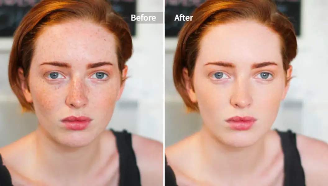
Use the AI Photo Retoucher for gentle cleanup that doesn’t kill texture. -
Selective color and brand control
If the campaign needs “one color stands out,” use the AI Image Colour Changer to hit that hue without manual masking. -
Web-based, no install
It runs on any machine. Share links, keep speed, and keep your team moving.
Small note on trust: I’ve spent 10+ years building content for high-competition niches and working with photographers and e‑commerce teams on image standards. The consistent win is workflow. Tools come and go. A repeatable method stays.
Quick comparison with popular online tools
-
Canva
Easy greyscale and sliders. Great for social posts and templates. Not built for deep monochrome control. -
LunaPic
A playground of effects. Fun for exploring looks. Less precise for pro-grade portraits. -
Picsart, BeFunky, Fotor
Plenty of filters and batch convenience. Good for speed. Check export quality and avoid overdoing effects. -
PhotoRoom
Excellent for product background work. You can apply B&W and clean backgrounds fast. Killer for e‑commerce. -
Carbon (iOS)
Specialized black and white filters and textures. Lovely tones on mobile. Handy on the go.
If you want a simple B&W filter, any of these will do. If you want a cohesive, brand-safe, and repeatable black and white look with smart local edits, Pixelfox AI tends to be faster and more consistent than juggling layers in desktop apps.
FAQs
-
How do I make a picture black and white without losing detail?
Use a true B&W conversion, not just desaturate. Then adjust color luminance to control how skin, sky, and foliage render. Add midtone contrast and keep blacks and whites within range. -
Why does my black and white look dull?
You probably flattened colors equally. Lift reds for skin, darken blues for sky, and push midtone contrast. Add small local edits for eyes and fabric. -
Can I do professional black and white on a phone?
Yes. Apps like Carbon and mobile-friendly web tools can do it. For deeper control, use Pixelfox AI in your browser and guide edits with prompts. -
What’s the difference between a black and white photo filter and a full editor?
A filter is a preset look. An editor gives you control over luminance by color, local adjustments, and export settings. You can make the same image look elegant or tacky based on these controls. -
Can I colorize a black and white photo after editing the B&W?
You can. Use a colorizer tool to add realistic color to an old B&W version. With Pixelfox’s Photo Colorizer, you can produce a color variant for comparison or storytelling.
Your next move
You don’t need to fight your images anymore. Pick a black and white picture editor that gives you control and speed, build a simple recipe, and keep it consistent across sets. If you want a tool that takes plain language and turns it into clean monochrome with smart local edits, try Pixelfox AI’s Image Editor and see how fast a good B&W can come together. Want color splash or gentle skin polish in the same flow? Use the AI Image Colour Changer and AI Photo Retoucher inside the same stack.
Give it a spin on your next portrait or product run. Then print one big. Black and white rewards confidence, and now you’ve got a process that earns it.
—
Author: A content strategist and photo workflow nerd with 10+ years in high‑competition niches. I help teams ship images that don’t just look good — they convert and build trust. According to NN/g, clear imagery reduces cognitive load; according to Forrester, better visuals support better outcomes. I’ve watched that play out in real campaigns, again and again.
P.S. If you’re optimizing for search, keep filenames and alt text clean. Use “black and white photo filter” or “image editor black and white portrait” in your alt tags. And yes, include the core term — black and white picture editor — in your final deliverable and page metadata.