 Credit

Most people ask the same thing every morning: what color should I wear? If you struggle with color matching skin tone and you get mixed answers from blogs and friends, you are not alone. This guide gives you a clear, photo-first method to figure out how to know what colors look good on you, then test them on your own images in minutes. You will build a personal color palette, validate outfits fast, and stop guessing. We use Pixelfox AI as the main toolkit so you can see results right away, online, with no downloads.
Why some colors change your face in seconds
Color is simple when you know the three parts that matter: hue (warm or cool feel), value (light or dark), and chroma (clear or muted). Your skin has a hue bias. It also has a value range and a clarity level. When a fabric sits near your face and shares your same color aspects, you look fresh and awake. When it fights your undertone, you look tired.
- Hue and temperature: Yellow-based hues feel warm. Blue-based hues feel cool. Your skin leans one way more than the other. Matching this lean reduces clash.
- Value: Colors that are too dark can swallow light faces. Colors that are too light can wash deep tones. You want value harmony.
- Chroma: Clear, bright shades pop on clear complexions. Muted, soft shades flatter soft complexions. You want chroma alignment.
Experts in color analysis talk about these three factors as the core of seasonal systems. You will see the same idea in many guides. Think about it like this: match the base feel first (warm vs cool), then tune lightness and saturation.
According to research from the Nielsen Norman Group, people finish tasks more often when the steps are short and clear. So we keep this process simple and visual. As Pantone notes in its SkinTone Guide, accurate skin tone work starts with clean measurement and consistent viewing. You will do the same thing at home by normalizing your selfie first, then testing colors on top.
Fast ways to tell your undertone and start picking
You want a quick path for how to tell what colors look good on you. Two classic tests work well at home in natural light.
-
Jewelry test
- Gold tends to look great on warm undertones.
- Silver tends to look great on cool undertones.
- Both look good if you are neutral.
-
Wrist vein test
- Greenish veins often signal warm.
- Bluish veins often signal cool.
- If you can’t tell, you may be neutral.
Warm undertones often love earth tones: amber, olive, rust, camel. Cool undertones often love jewel tones: emerald, sapphire, ruby, fuchsia. Neutral undertones can mix both, but still do better when value and chroma match.
专家提示 ①
Stand near a window. Remove makeup. Wear a white or light neutral top. Then do the two tests above. Natural light helps you avoid indoor color casts that can trick your eyes.
When you know the direction, you can start your personal color palette with three pieces:
- Two or three base neutrals that match your undertone and your value (e.g., warm taupe and olive for warm, cool charcoal and navy for cool).
- Two accent colors that add life (e.g., rust and mustard for warm, emerald and berry for cool).
- One bright or deep “power color” that you use sparingly and only near your face when the lighting is good.
Color matching skin tone in 7 steps (photo-first workflow)
You will learn how to figure out what colors look best on you by testing them on your own images. This is the fastest way to remove doubt. Every step takes only a few clicks.
Step 1: Normalize your selfie for fair testing
Start with a clean photo. Use natural light if you can. Then fix small issues so your skin looks like your real self.
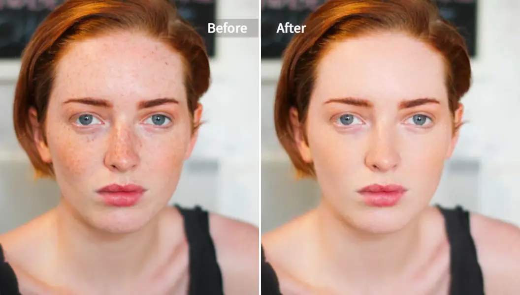
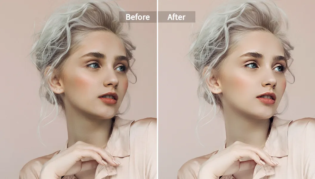
- Use Pixelfox AI Photo Retoucher to smooth small blemishes and balance skin tone without changing the background. It keeps texture real, which helps your eye compare colors.
- If your portrait needs extra glow or micro-adjustments, try the AI Face Beauty tool to bring back radiance while you keep the face natural.
This prep matters. It reduces noise so colors stand out as they should.
Step 2: Confirm undertone with quick checks
Do the jewelry and vein tests. Then pull three tops from your closet:
- One gold-leaning warm top (e.g., mustard or rust).
- One blue-leaning cool top (e.g., navy or sapphire).
- One neutral (e.g., taupe or charcoal).
Hold each near your face in front of a mirror. Watch under-eye shadows and lip color. The best colors reduce shadows and make your eyes clearer.
Step 3: Build a starter personal color palette
Create a short list:
- Base neutrals (2–3): choose warm taupe, olive, camel or cool charcoal, navy, grey based on your tests.
- Accents (2–3): warm set could be rust, terracotta, mustard. Cool set could be emerald, cobalt, berry.
- A light tint and a deep shade for contrast control (e.g., cream and deep pine if you are warm, ice grey and ink blue if you are cool).
Write down your picks. This is your skin tone color scheme.
专家提示 ②
Start with neutrals first. They touch most outfits. If your base neutrals are wrong, everything feels off. Once your base is solid, accents are easy.
Step 4: Validate your picks on a real image
Now test your palette fast without changing your wardrobe yet.
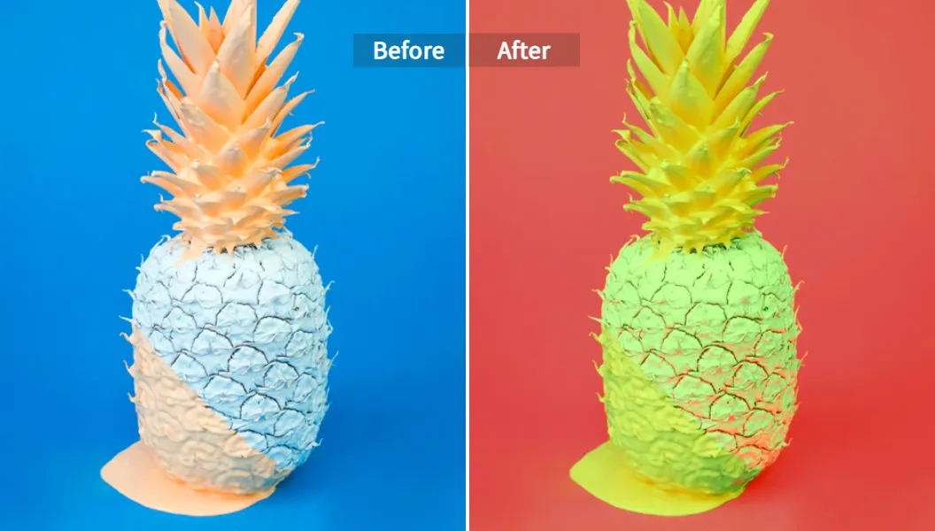
- Use the AI Image Color Changer to recolor garments in your photo.
- Try “Custom Palette” mode to apply your chosen shades to tops, scarves, or accessories.
- Watch how each color affects your face. Keep the colors that calm shadows and add life.
Step 5: Stress-test neutrals and accents
You do two passes:
- Pass A: Neutrals only. Keep lighting as is. Recolor your top to taupe, olive, camel, charcoal, navy, grey. Pick the two or three that always look safe no matter the time of day.
- Pass B: Accents only. Try rust vs terracotta (warm) or emerald vs teal (cool). Watch small details like lip tone and under-eye area. Good accents lift those. Bad ones add shadows.
When you run both passes, you get a clear set that works on you more often than not.
Step 6: Preview full looks with one click
Some people like to test a full vibe before shopping. Use Color and Lighting AI Transfer to match a reference look’s color and light onto your photo. This helps you see a head-to-toe color combination based on skin tone, including jacket, scarf, or dress style in one move.
You can pull a reference from a street shot you love. Then see how that scheme works on you.
Step 7: Save, batch, and reuse
You want speed later. Save your palette. Set up a small batch of outfit shots.
- One top with no print.
- One jacket or cardigan.
- One scarf for face framing.
Run quick recolors in batches with the same palette. Your eye learns fast. You will know what color suits me and what color suits me best very quickly.
If you work with vintage photos and want to test skin tone colours on old looks, you can use the Photo Colorizer to bring black & white images into color. Then apply the recolor tool to align outfits with your palette.
What color should I wear today? Use a 80/20 rule
A simple rule keeps your wardrobe clean:
- 80% core: pick two or three base neutrals and one or two soft accents that flatter you all year.
- 20% bold: pick one or two “statement” shades that you use for special days or unique pieces.
This balance lets you pair more outfits with less friction. It also keeps shopping easy. You buy what fits your skin tone color scheme first, then add fun later.
Advanced tactics that pros use
These tricks help when you want next-level control.
- Tune white balance before testing. Your phone often cools indoor shots or warms outdoor shots. Fix white balance so skin looks real. Then recolor. This gives you cleaner comparisons.
- Use Pantone logic for skin matching. Pantone’s SkinTone work shows why consistent color reading matters. If you edit skin and outfit under the same light and keep exposure steady, your choices hold up on more screens.
- Control fabric texture. High-shine fabrics can throw color back onto your face. Matte or textured fabrics soften reflections. When you test accents, load a matte version first.
- Map accents to eye color. If you have green eyes, try warm olive or deep forest. If you have blue eyes, try cool navy or cobalt. When the garment echoes your eyes, your gaze looks sharper.
How Pixelfox AI compares to old-school software
You can do all of this in heavy desktop tools, but most people don’t need that.
- No learning curve: Pixelfox gives you one-click workflows to recolor and retouch. You don’t need layers or masks.
- No downloads: Work in the browser on any device. You can run quick tests right after a shopping trip.
- Background stays intact: The retoucher targets skin and keeps the scene real. That helps your eye judge color on the face, not the background.
- Batch-friendly: You can try several images in a row with the same palette, which speeds up decision making.
Classic tools like Photoshop can do more complex edits and they are great for pros, but they take time and skill. Most people want fast answers to what colour clothes suit me and how to find what color looks best on you. For that, Pixelfox is faster.
Real-world case study ①: Fashion seller reduces costly returns
A mid-sized fashion e‑commerce team kept hearing complaints like “the color looks different on me.” They wanted a skin tone color scheme that works for more customers. The team used Pixelfox to test product hero shots on models with diverse undertones.
- They normalized portraits with the AI Photo Retoucher to keep skin true.
- They recolored tops with the AI Image Color Changer to test warm vs cool variations of the same SKU.
- They chose base neutral options for each product page that matched a wider range of undertones.
In A/B tests, the team saw a clear lift in add-to-cart. Customer care saw fewer color-related tickets. The work was fast and repeatable, so it fit the workflow without slowing content production.
Real-world case study ②: Creator finds two “power accents” and boosts engagement
A content creator struggled with mixed advice. Some videos said she was warm. Some said cool. She felt lost and asked how to figure out what colors look best on you without an in-person session.
She used the two home tests and leaned cool. Then she used Pixelfox to run a quick comparison:
- She recolored tops to emerald, teal, cobalt, and berry.
- She watched under-eye shadows and lip tone on each.
- She picked cobalt and berry as her “power accents.”
Her posts got more saves when she used those accents near the face. Her audience said she looks more awake. She kept her base neutrals as charcoal and navy, which made pairing outfits easier.
Best practices that make your palette stick
- Test in natural light when you can. Lighting changes color.
- Keep one “control” photo for audits. Use the same pose and background for checks.
- Try a soft makeup day for color tests. Heavy colors on lips or eyes can skew your read.
- Make one small change at a time. Change a top first. Then test scarves. Then test jackets.
- Save notes. A short list beats memory when you shop later.
Common mistakes and how to avoid them
- Switching hair color without adjusting your palette. The hair near your face changes the feel. Re-test accents when you go from deep brunette to bright blonde or vice versa.
- Ignoring fabric texture. Shiny satin can reflect color onto your skin and make it look strange. Matte cotton or wool shows the true color better.
- Chasing trends over fit. Trend colors may not match your undertone. Try them in a small accessory first. If they clash, skip the full piece.
- Over-relying on one indicator. Do both tests. Try a mirror check. Run a recolor test. Stack these methods so your answer is strong.
Why this approach aligns with UX and color science
Color is emotional, but your method should be stable. A simple workflow helps you focus.
- As NN/g points out, short, clear tasks increase success and reduce errors. You have clear steps here: normalize, check, build, recolor, save.
- As Pantone’s SkinTone work shows, consistent measurement and viewing matter. You mirror that by fixing white balance and using the same photo for checks.
- As Forrester often notes in customer experience studies, faster feedback loops improve outcomes. Your photo-first testing gives instant feedback so you can act.
These points support a workflow that is practical and repeatable. You will make better choices with less stress.
FAQ: quick answers to the big questions
-
How do you know which colors look best on you?
Start with jewelry and vein tests in natural light. Then pick three neutrals and two accents and test them on a normalized selfie with the AI Image Color Changer. Keep the shades that reduce under-eye shadows and enhance your eyes. -
Why do some colors make me look tired?
They fight your undertone or value. Cool colors can drain warm complexions. Very dark shades can overwhelm light faces. Adjust hue, then value and chroma, to match your skin. -
Can I use this method if I change my hair color or get a tan?
Yes. Just re-run a quick pass. Hair near your face acts like a colored frame. It changes how colors behave. Tans shift value, which can change which shades work best. -
What’s the difference between warm, cool, and neutral skin tone colours?
Warm leans yellow and loves earth tones. Cool leans blue and loves jewel tones. Neutral can mix both but still benefits from value and chroma alignment. -
How can I build a personal color palette fast?
Pick two or three base neutrals that suit your undertone. Add two accents that lift your face. Validate with Pixelfox by recoloring a top and a scarf. Save the winners. -
Can Pixelfox AI handle multiple images quickly?
Yes. You can upload several images and apply the same palette in quick steps. This helps you audit your wardrobe and plan shopping faster.
The simple path to color confidence
Now you know a photo-first way to master color matching skin tone. You know how to find what color looks best on you. You built a personal color palette. You tested real images. You saved your winners so you can use them every day. When your base neutrals fit your undertone and your top two accents lift your face, you look confident in minutes.
Try these tools now and see the difference on your own photos:
- Clean and balance your selfie with the AI Photo Retoucher.
- Enhance natural radiance with AI Face Beauty.
- Recolor your clothes to validate warm vs cool palettes in seconds with the AI Image Color Changer.
- Preview full looks with Color and Lighting AI Transfer.
- Colorize vintage images and test palettes on history with the Photo Colorizer.
When you work this way, you remove guesswork. You spend less time in front of the mirror. You wear colors that feel like you. And you get a wardrobe that truly works.
About the author
I’m an SEO content strategist and color analysis writer with 10+ years in fashion tech, SaaS, and consumer apps. I focus on practical, photo-first workflows that help real people get results fast. I do not claim medical or dermatology expertise. Lighting and device screens can change perception. Always test shades on your own images and in real light for best results.