 Credit

Suggested URL: /color-ai
If “color ai” has ever handed you a palette that looks like a gas station logo from 2009… yeah, you’re not alone. Designers want good-looking, usable colours fast. What they often get is five random hex codes and a shrug. This guide fixes that: you’ll learn what color AI actually is in 2026, why some AI palettes look expensive and others look cursed, and how to turn “ai colours” into real UI tokens, brand palettes, and scroll-stopping visuals—with Pixelfox AI as the practical workhorse.
What “color ai” means (and what it doesn’t)
In late 2025 and going into 2026, Google results for color ai mostly map to one thing:
AI color palette generators (aka “give me a vibe → give me a palette”).
But “color ai” can also mean a few side quests:
- AI image recolor: swap colours in an existing photo or design while keeping it natural
- AI photo colorization: add colour to black-and-white photos
- AI coloring page generators: line-art for kids/adults (fun, but different intent)
So when someone searches color ai, the main job is usually:
“I need a palette I can actually use in a product, brand, or post… like, now.”
And the hidden pain behind that:
“It must work in dark mode, pass contrast, export cleanly, and not look like a clown suit.” 🤡
Why most AI palette tools still disappoint (the real reasons)
People blame AI when palettes look “random.” Fair.
But the real culprit is usually missing context.
Here’s what many tools do today:
- They optimize for “looks cool” in isolation
- They ignore where the colours will live (text, buttons, background, charts)
- They don’t enforce accessibility rules
- They give no explanation, so you can’t fix the result
You end up with a palette that is “pretty” and also useless.
The 4 classic failure modes (I see these weekly)
1) No role assignment
A palette without roles is like giving you “ingredients” but no recipe.
You need: background, surface, text, primary, accent, border, states.
2) Contrast gets ignored
According to W3C WCAG guidelines, normal text needs at least 4.5:1 contrast against its background (3:1 for large text). If your tool doesn’t care, your UI becomes a readability tax.
3) Hue randomness without a “base”
Good palettes usually orbit a base hue, then add controlled contrast.
Bad palettes spray colour like a toddler with markers. (Adorable. Not shippable.)
4) No dark mode logic
Light mode palettes often collapse in dark mode.
Your “cute pastel text” becomes “why is nothing readable.”
Nielsen Norman Group has long pushed a simple usability truth: don’t rely on colour alone to communicate important info, and keep visual hierarchy clear. If your palette blurs hierarchy, UX suffers even if Dribbble likes it.
What good color AI should do (a checklist you can actually use)
A serious color ai workflow should give you:
- Context: brand vibe, industry, audience, platform (web/app/social)
- Roles: primary/secondary/background/surface/text/semantic colours
- Dark mode pairing: not as an afterthought
- Accessibility checks: contrast-aware suggestions
- Export options: CSS variables, Tailwind tokens, Figma-ready values
- Editability: you can nudge it without breaking harmony
- Consistency across assets: the palette should survive real photos and marketing images
And this is where most “palette-only” tools fall short:
They generate colours. They don’t help you apply them.
That’s why I like using Pixelfox AI as the “make it real” layer.
Pixelfox AI: turning “nice colours” into usable visuals (fast)
A lot of palette tools stop at hex codes. Cool, thanks.
Now go recolor 30 product photos or a hero image by hand. 🫠
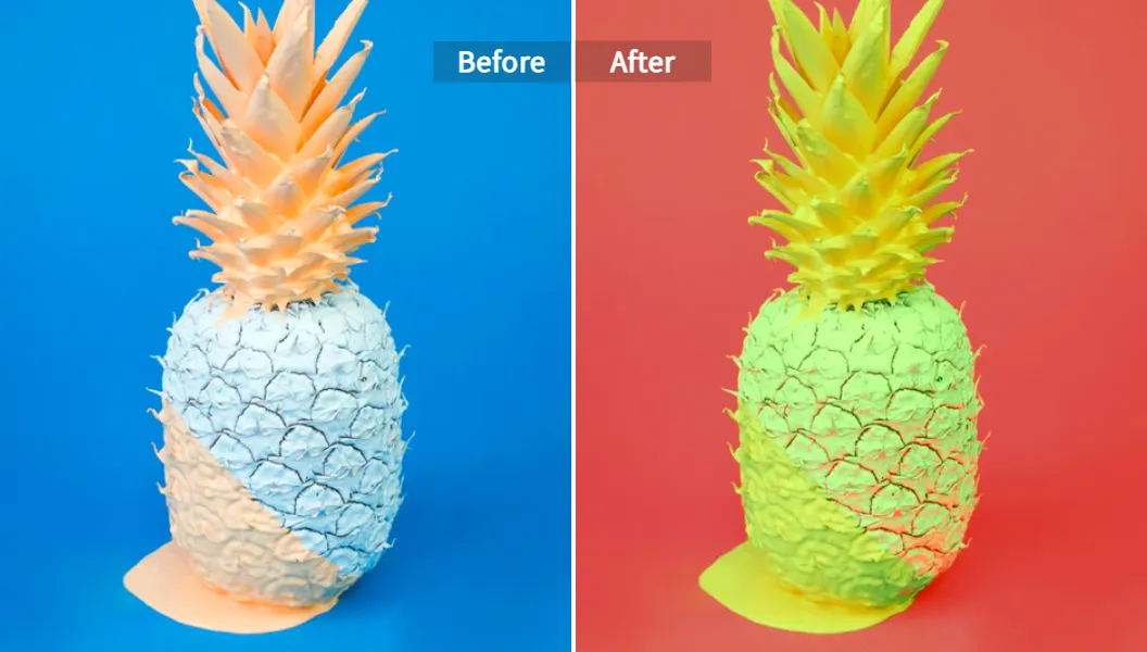
With Pixelfox AI, you can push past inspiration and into execution. The big win is that it’s built to recolor images using AI, with options that map nicely to how designers actually work: custom palettes, reference images, and automatic expansion that keeps the image natural.
If your “color ai” goal includes real assets (marketing, product, UI mockups), start here: Pixelfox AI Image Colour Changer.
A practical workflow: vibe → palette → asset → system
Here’s a workflow that doesn’t fall apart after step one.
Step 1: Decide the job of the palette (not just the vibe)
Pick one primary objective:
- “SaaS trust + modern”
- “Streetwear drop + bold”
- “Skincare + clean + premium”
- “Gaming UI + neon but readable”
Write it like a sentence. AI responds better to human intent than to “make it cool”.
Step 2: Use one of three recolor approaches (the Pixelfox way)
Pixelfox supports three modes that matter in real work:
- Automatic Color Expansion: fast refresh, keeps harmony
- Custom Palette Recolor: you feed the palette, AI applies it cleanly
- Reference Image Recolor: you feed a “vibe image,” AI remaps the target
That last one is chef’s kiss for brand consistency.
Tip: If you want “premium” results, stop prompting in a vacuum. Use Reference Image Recolor with a brand moodboard image (or a competitor vibe you like 👀). AI gets smarter when you show it, not just tell it.
Step 3: Export and reuse (don’t let colours die in one image)
Once you get an output you like, lock it in:
- Save the hex codes
- Assign roles (primary, background, text)
- Reuse across your next assets so your brand doesn’t shape-shift every week
Pixelfox also supports common formats (PNG/JPG/JPEG/BMP) so you’re not fighting file types like it’s 2012.
Prompts for “ai colours” that don’t produce nonsense (copy/paste)
Prompting colour is weird because most people describe feelings, not constraints.
So give both.
Below are prompt patterns that work across tools, and also pair well with a “reference image recolor” approach in Pixelfox.
Brand palette prompts (clear + controlled)
SaaS / fintech
- “Create ai colours for a fintech dashboard. Trustworthy, calm. One deep blue primary, one teal accent, neutral grays for surfaces. Must work in dark mode.”
Creator / portfolio
- “Color ai palette for a personal portfolio. Clean white background, one warm accent, one cool accent. Minimal and modern. High contrast text.”
DTC skincare
- “AI colour palette for skincare packaging. Soft neutral base, muted green accent, premium feel. Avoid neon.”
Campaign prompts (seasonal without being cheesy)
- “Halloween palette but not childish: burnt orange, deep maroon, warm gray neutrals, one highlight colour.”
- “Summer drop: bright but not neon, beach vibe, readable text on light background.”
UI-specific prompts (role-based, way better)
- “Generate a UI palette with roles: background, surface, text, muted text, border, primary, primary hover, destructive, success. Modern style. Dark mode included.”
Bad prompt vs good prompt (quick reality check)
Bad: “make a cool palette”
Good: “make a 6-colour palette for a landing page, white background, one primary, one accent, neutrals, accessible text contrast”
AI isn’t magic. It’s a calculator with confidence.
From AI palette to Figma/Tailwind/Shadcn (without chaos)
This is the part competitors usually skip, and it’s why their users bounce.
A palette is not a system. You need structure.
1) Assign tokens (roles) immediately
Use a simple map:
bg/surface/bordertext/text-mutedprimary/primary-foregroundaccent/accent-foregroundsuccess/warning/danger(optional)
If you don’t do this, you’ll end up with final_final_blue_2 in your CSS.
That file will haunt you.
2) Check contrast (don’t guess)
WCAG contrast targets:
- 4.5:1 for normal text
- 3:1 for large text
Even if you’re not building a government site, readability is not optional.
It’s UX.
Tip: When AI gives you a gorgeous primary colour, test it on both white and near-black. If it fails, keep the hue and change the lightness. You keep the “vibe” and you gain usability. That’s the whole game.
3) Export in a format your stack likes (example)
Here’s a clean CSS-variable pattern you can paste into a project:
:root{
  --bg: #ffffff;
  --surface: #f5f6f8;
  --text: #0c0c1b;
  --muted: #6b7280;

  --primary: #1f3a8a;
  --primary-fg: #ffffff;

  --accent: #ee6c4d;
  --accent-fg: #0c0c1b;

  --border: #e5e7eb;
}
.dark{
  --bg: #0c0c1b;
  --surface: #151931;
  --text: #e7d1bb;
  --muted: #a096a5;

  --primary: #60a5fa;
  --primary-fg: #0c0c1b;

  --accent: #f59e0b;
  --accent-fg: #0c0c1b;

  --border: #2a2f45;
}
If you use Tailwind, you can map these variables to theme tokens and stop hardcoding hex values everywhere.
Comparison time: color AI vs Photoshop vs online tools
Let’s talk tradeoffs, not marketing fluff.
Color AI vs “I’ll do it in Photoshop”
Photoshop is powerful.
It’s also a time tax if your goal is “give me 10 palette directions in 20 minutes.”
Photoshop wins when:
- You need precise manual grading
- You need masks, blend modes, selective edits per region
- You’re matching an exact print standard
Color ai wins when:
- You need fast exploration
- You need options that stay harmonious
- You want to test mood quickly across many assets
In practice, the best workflow is hybrid: Use AI to get 80% of the way, then do tiny manual nudges if needed.
Pixelfox AI vs palette-only generators (Coolors / Colormind style)
Tools like Coolors and Colormind are great for inspiration.
They’re fast. They’re popular. They also often stop at “here are colours.”
Where Pixelfox plays differently:
You can apply colour decisions to real images. That matters when your “palette” must show up in:
- product shots
- hero banners
- social thumbnails
- ads
- app store screenshots
So instead of arguing about five hex codes, you see the colours living in the work.
Pixelfox AI vs image colorizers (Krea-style)
Krea’s colorization tool is aimed at “add colours to photos,” often black-and-white or stylized. That’s a different job.
Pixelfox can support that broader “colour transformation” workflow, but the key difference is your intent:
- Colorizer: bring colour to monochrome images
- Recolor: change an existing palette while keeping realism and harmony
Both are useful. Just don’t use a hammer as a screwdriver.
Advanced “plays” (stuff pros do when nobody’s watching) 😈
You wanted more than basics. Good.
1) Build a campaign look across photos without re-shooting
Scenario: you have 40 product images from different days. Lighting is inconsistent.
Your brand page looks like a garage sale.
Do this:
- Pick one “hero” image that feels right
- Recolor other images to match the hero palette using Pixelfox’s recolor workflow
- For video creatives, keep colours consistent using AI Video Enhancer (this matters more than people admit)
Now your campaign looks intentional, not accidental.
2) “Steal” lighting + colour mood from a reference (but make it usable)
You see a cinematic still with perfect moody tones.
You want that vibe in your brand, without copying it pixel-for-pixel.
Use AI colour and lighting transfer to move the mood onto your own image, then extract a working palette from that result.
This gives you a palette that already “lives” in a real scene, so it feels less random.
3) Blend two vibes into one new direction
When stakeholders argue (“make it minimal” vs “make it bold”), you can literally merge directions.
Try AI Image Blender to combine two visual references, then generate a palette direction from the blended result.
It’s like couples therapy for brand boards.
Real-world case studies (2 quick ones, real workflow)
Case study 1: Indie SaaS landing page that stopped looking generic
Problem: A developer had a clean landing page, but it screamed “default Tailwind theme.”
Everything looked fine. Nothing felt branded.
What worked:
- Chose one strong reference image (a bold, modern tech photo)
- Used Pixelfox AI Image Colour Changer to remap the hero illustration to match that vibe
- Extracted roles: primary, accent, surface, border, text
- Verified contrast for buttons and body text (WCAG targets)
- Dropped tokens into Tailwind variables
Result: The site finally looked like a product, not a template.
The biggest win was speed: direction in under an hour, not two days of “maybe this blue?”
Case study 2: Shopify brand with messy product photos + inconsistent reels
Problem: The store had nice products. The media looked inconsistent.
Different lighting, different backgrounds, different “moods.”
What worked:
- Picked one campaign palette (“warm neutral + one punchy accent”)
- Recolored key product photos to match
- Used AI Video Enhancer to bring reels closer in colour and clarity
Result: The grid looked cohesive. The brand looked more premium.
No re-shoot. No complicated editing pipeline. Just smart colour control.
Newbies and even pros mess this up: 7 common color ai mistakes
1) They chase “pretty,” not “usable”
Fix: assign roles and test contrast immediately.
2) They use too many accents
Fix: one primary, one accent, neutrals. Add more only when the UI demands it.
3) They ignore dark mode until the end
Fix: generate or design dark tokens at the same time.
4) They pick colours that fight the content
Fix: let content lead. If photos are warm, don’t force icy neon.
5) They don’t name tokens
Fix: name by role, not by colour: primary, not blue-500-but-not-really.
6) They trust AI’s first draft
Fix: treat AI like a junior designer who works fast and needs feedback.
7) They forget accessibility is a brand feature
Fix: follow WCAG contrast rules. Also remember NN/g’s guidance: colour should support hierarchy, not replace it.
Pro best practices for ai colours (the “do this and you’ll look senior” list)
- Start from a reference image when you can (it anchors the palette in reality)
- Keep neutrals slightly tinted (pure gray often looks dead)
- Prefer one strong primary over three weak ones
- Pick semantic colours (success/warn/danger) that stay distinct for colour-blind users
- Design light + dark together, and keep role names consistent
- When stakeholders argue, show palettes on real UI screens, not as floating swatches
FAQ
How does color ai generate palettes, really?
Most tools learn patterns from large sets of design palettes, photos, and style data. They predict colours that “fit together” based on what they saw during training. The good tools also enforce rules around harmony, contrast, and roles. The weak tools just output five nice-looking colours and call it a day.
Why do some AI palettes look good but fail in real UI?
Because UI needs roles and contrast, not just harmony. A colour can be pretty and still be unreadable as text or indistinguishable as a button state. WCAG contrast checks catch this fast.
Can Pixelfox help if I already have brand colours?
Yes. You can feed your colours as a custom palette and use recoloring to apply them across images so your marketing stays consistent. That’s the practical side of “color ai” that palette-only tools don’t cover.
What’s the difference between AI image recolor and AI photo colorization?
Recolor changes an existing colour scheme while keeping the image natural.
Colorization adds colour to black-and-white images. Different goals, different workflows.
Can I use Pixelfox AI results commercially?
Pixelfox is built for creators and teams doing real projects, including marketing and brand work. If your use case includes client work, campaigns, or product visuals, that’s exactly where AI recolor tools earn their keep.
Your next move (make color ai actually useful)
Color inspiration is cheap. Execution is expensive.
That’s why color ai only becomes valuable when you can turn a palette into consistent, real assets that ship.
If you want the shortest path from “I need ai colours” to “this looks like a real brand,” start with Pixelfox AI and use the recolor workflow to test palettes on actual images, not just swatches. Do that a few times and you’ll stop treating color ai like a gimmick—and start using it like a serious advantage.